At Xcase.me, we strive to push the boundaries of traditional phone case art, creating pieces that resonate with bold personalities and unique tastes. Our latest design, Doom Girl, is an expression of raw energy, dark fantasy, and bold contrasts that captivate onlookers with its intensity. Today, we’re excited to take you behind the scenes to share the creative journey behind Doom Girl, from concept to final product.
1. The Inspiration: Bold, Dark, and Mysterious
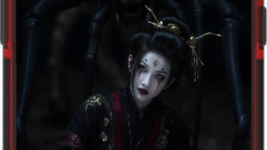
The concept for Doom Girl was born from a fascination with dark aesthetics and horror-inspired art. We wanted to create a phone case design that would be visually striking, intense, and unapologetically unique. The inspiration comes from horror and fantasy genres, combining elements of anime style, intense color contrasts, and an otherworldly allure.
Our goal was to design a case that evokes a sense of power, mystery, and even a hint of chaos. We imagined a character who embodies strength and resilience but has an edge of danger—a complex persona that immediately draws attention.
2. Designing the Character: “Doom Girl”
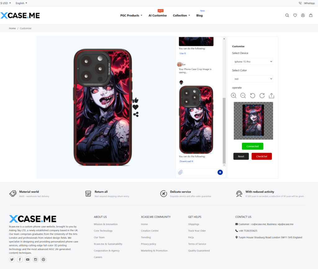
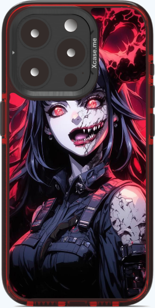
The central figure of this design, whom we’ve named Doom Girl, needed to convey both beauty and menace. Her features are both haunting and hypnotic, with crimson red eyes that seem to glow with an intense inner fire. Her cracked skin, exposed mouth, and unsettling gaze hint at a hidden power, blurring the line between human and supernatural.
We carefully designed her attire to add to her dark persona. With a high collar and tactical-style vest, her outfit has a modern, edgy look that contrasts with her fantastical appearance. The cracked details and intricate shading give a textured, slightly battle-worn look, suggesting resilience despite her seemingly monstrous traits.
3. Creating the Atmosphere with Color and Contrast
Color plays a crucial role in the Doom Girl design. We chose a dark red and black color scheme to enhance the intensity of the character, creating an almost sinister atmosphere. Red is a color associated with passion, power, and danger—all themes that are central to Doom Girl’s essence.
The background is designed to amplify this effect, featuring a swirling red energy that mirrors the fire in her eyes. The black and red contrast highlights her haunting expression and cracked skin, making the character stand out with an almost three-dimensional effect. The intense red glow surrounding her creates a focal point that pulls the viewer’s attention, giving the case an aura of both beauty and danger.
4. AIGC in Action: Developing Textures and Details
The intricate details in Doom Girl were made possible through AIGC (AI-Generated Content) techniques. With AI tools, we were able to explore various character textures, shading styles, and expressions to find the perfect balance for her look. AIGC allowed us to quickly test different elements, such as the level of cracking on her skin or the intensity of her eye glow, and refine each detail until it perfectly matched our vision.
- Skin Texture and Cracks: We experimented with different textures to give her skin a cracked, weathered appearance. This adds a sense of mystery and danger, as if her power is too much for her physical form to contain.
- Eyes and Expression: Her piercing red eyes are the focal point, so we paid particular attention to their shape, glow, and the emotion they convey. They’re designed to be both beautiful and chilling, capturing the essence of Doom Girl’s mysterious nature.
- Background and Lighting Effects: The swirling red and black backdrop adds depth and movement to the design, making it feel as if she’s emerging from the shadows. The lighting highlights certain areas of her face and attire, creating an eerie, otherworldly effect.
5. Refining the Design: Balancing Horror and Beauty
One of the biggest challenges in designing Doom Girl was finding the perfect balance between horror and beauty. We wanted a character who was fierce and intense but not overly terrifying, so the design would appeal to a broad range of audiences who appreciate bold, dark aesthetics.
To refine this balance, we worked with feedback from our design team and early testers. We adjusted the level of intensity in her expression, ensuring that her features were striking without being overly aggressive. Subtle adjustments to her facial structure, the shape of her smile, and the glow of her eyes helped us achieve a look that’s intense yet mesmerizing.
6. From Digital to Physical: The Final Print
As always, the final step in our process is translating the digital artwork to a physical phone case, ensuring that every detail—color, texture, and contrast—is preserved in print. For Doom Girl, we chose high-quality materials that capture the depth of the black and red color scheme, bringing out the fine details in her facial features and attire.
The final product is a phone case that feels both powerful and visually captivating. Each time you look at Doom Girl, you can almost feel her staring back, as if challenging you to embrace your own strength and intensity.
7. Doom Girl: A Phone Case That Stands Out
The Doom Girl phone case is for those who aren’t afraid to stand out. She’s bold, she’s intense, and she brings a touch of dark beauty to your everyday carry. At Xcase.me, we believe in creating designs that resonate on a personal level, and Doom Girl is a testament to the power of embracing your own inner strength and mystery.
This design isn’t just a phone case; it’s an art piece and a conversation starter. We hope Doom Girl empowers you to embrace your individuality, showing the world that there’s beauty in intensity.