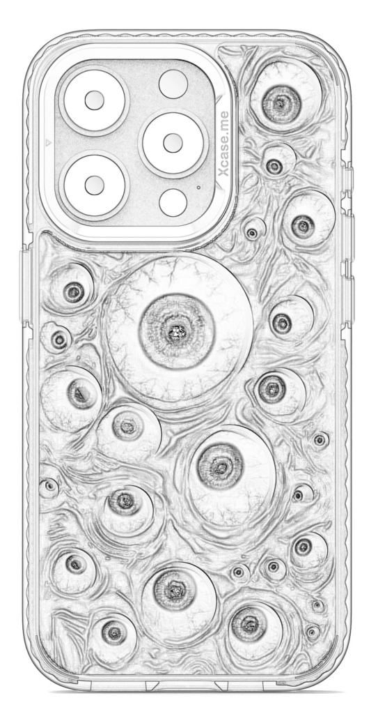
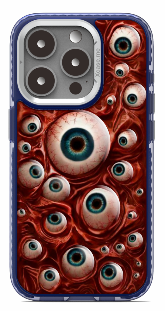
The Gaze into the Abyss collection at Xcase.me is not just another phone case series—it’s a deep, moody exploration into the unknown, the mysterious, and the profoundly introspective. The collection taps into dark color schemes, bold contrasts, and mesmerizing patterns, capturing a sense of intrigue that resonates with those who enjoy the beauty of the unknown. In this post, we’ll take you behind the scenes to share how this unique collection came to life, from initial concepts to final designs.
1. The Spark of Inspiration: Concept and Theme Development
Our journey with Gaze into the Abyss began with a simple idea: to create a collection that captures the essence of depth and mystery. We wanted to evoke a sense of introspection, as though each case is an invitation to explore one’s own thoughts or gaze into the secrets of the universe. To bring this vision to life, we drew inspiration from various sources, including deep-sea photography, nebulae, and abstract art.
The concept was to create cases that would resonate with customers who see beauty in the mysterious and the unknown. We chose dark, evocative hues—deep blues, blackened purples, and muted grays—that give the collection its characteristic intensity. Paired with organic, flowing patterns, these colors create an almost hypnotic effect, inviting the viewer to “gaze into the abyss.”
2. Exploring Patterns and Textures with AIGC
Once the concept was in place, the next step was exploring patterns and textures. AIGC (AI-Generated Content) played a crucial role here, as we could experiment with multiple textures and formations quickly and accurately. Our design team collaborated with AI algorithms to produce original patterns that evoked both fluidity and depth, suggesting vast oceans, stormy skies, or distant galaxies.
The AIGC models allowed us to:
- Generate Multiple Options: AI helped us generate dozens of variations with unique flow patterns, blending colors and shapes to create the deep, mysterious atmosphere we envisioned.
- Refine Textures: Some patterns came out too intense, while others were too light. With AIGC, we could continuously adjust textures until we achieved a perfect balance, giving each case the appearance of both darkness and light within.
- Experiment with Symmetry and Asymmetry: We played with the placement of abstract elements, deciding whether certain cases should have symmetrical patterns or more chaotic, organic shapes. This balance between order and randomness is central to the collection’s otherworldly appeal.
3. Finding the Perfect Color Palette
The Gaze into the Abyss collection wouldn’t be complete without its signature color palette, which we carefully curated to maintain a sense of intrigue. We wanted a range that felt mysterious yet harmonious, where colors blend smoothly into one another, creating a visual depth.
Through testing and feedback, we developed several core colors:
- Deep Indigo and Midnight Blue: These serve as the primary background colors, evoking the feeling of looking into the night sky or deep ocean.
- Muted Gray and Smoky Purple: These colors add depth without overwhelming the main hues, balancing bold and subtle tones.
- Hints of Silver and Teal: To give certain designs a glimmering effect, we added subtle touches of silver and teal, suggesting the glint of light or distant stars.
4. Incorporating User Feedback and Iteration
Before finalizing the designs, we shared early versions of the Gaze into the Abyss collection with a select group of customers and team members to gather feedback. This stage was essential for ensuring the designs would resonate with the intended audience.
Feedback revealed that people loved the darker, moodier hues but wanted a bit more visual interest, so we adjusted a few designs to include extra contrast or slight accents of brighter colors. This iterative process was crucial to getting the balance just right, ensuring each case could stand on its own while staying true to the collection’s overall theme.
5. From Digital Render to Physical Product
Once we finalized the designs digitally, it was time to bring Gaze into the Abyss into the real world. The transition from screen to case is critical—what looks beautiful on a monitor must look equally striking on a phone case. We conducted extensive print tests to ensure that the colors, patterns, and textures came through with the same depth and detail as they did digitally.
Each case in this collection is printed with high-quality materials to retain the sharpness and intensity of the design, making sure that every detail is preserved. Our production team oversees this process carefully, treating each case as a work of art that deserves a meticulous touch.
6. Final Release: The Collection Goes Live
The release of the Gaze into the Abyss collection has been a thrilling moment for us at Xcase.me. We poured our creativity, time, and passion into each case, and seeing our customers connect with these designs has been immensely rewarding. We’re excited to watch this collection resonate with those who appreciate its depth, mystery, and mood.
In the end, Gaze into the Abyss is more than just a series of phone cases—it’s a journey into the unknown, a visual expression of curiosity, and an invitation for self-reflection. We hope this collection becomes a beloved part of our users’ lives, reminding them to embrace the beauty in mystery every day.