At Xcase.me, our goal is to craft phone cases that go beyond protection—they’re made to express personality and evoke emotion. One of our most alluring collections, Blue Seduction, brings a calming yet captivating energy, drawing inspiration from the mesmerizing beauty of water, waves, and the depths of blue. Today, we’re taking you behind the scenes to share the creative journey of Blue Seduction, from initial inspirations to the final designs.
1. Concept and Inspiration: Embracing the Allure of Blue
The idea for Blue Seduction began with a simple vision: to create a collection that feels as serene and hypnotic as a calm ocean at dawn. We wanted to capture the quiet power of water, its elegance, and its constant motion, all within a color scheme that evokes peace and introspection. Blue, as a color, carries a timeless appeal; it’s known for its calming properties and its versatility, capable of conveying both tranquility and depth.
Our team envisioned a collection where different shades of blue could interact with natural patterns to create an effect that’s soothing yet eye-catching. With this in mind, we began exploring artistic elements that would reflect these qualities, from rippling waves and shimmering reflections to abstract fluid forms that suggest movement.
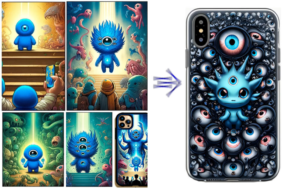
2. Crafting Patterns with AIGC
Once we solidified our theme, we turned to AIGC (AI-generated content) to explore pattern ideas. By blending organic water-like shapes with gradient blues and silvers, we could create the hypnotic, fluid effect we wanted for Blue Seduction.
Our AIGC process allowed us to:
- Experiment with Flowing Forms: Using AI, we generated smooth, flowing patterns that imitate the natural currents of water, capturing both gentle ripples and more turbulent swirls.
- Balance Contrast and Texture: We explored various textures to give each case a “liquid” look, adjusting the brightness and blending of the blues to maintain a layered depth. Some designs emphasize a glassy, reflective surface, while others capture an inky, ocean-like quality.
- Create Seamless Transitions: In this collection, gradients play an essential role. AI allowed us to generate subtle transitions between shades of blue, which mirror the way light diffuses across water, giving each case a dynamic yet harmonious feel.
3. The Perfect Shades of Blue: Color Selection
The colors for Blue Seduction were chosen with care to reflect different aspects of water’s allure. We experimented with an array of blues, from lighter, breezy shades to dark, enigmatic tones. Ultimately, the collection’s palette was defined by a mix of:
- Deep Navy and Midnight Blue: Representing the darker depths of water, these shades provide the grounding tones for many designs, creating an air of sophistication.
- Aqua and Teal: These bright, playful colors add a splash of vibrancy, evoking clear ocean waters and a sense of refreshment.
- Silvery Highlights: To create a glistening, reflective quality, we incorporated touches of silvery white and gray, which simulate the way light dances across water surfaces.
This carefully selected palette brings both contrast and cohesion, allowing each case to feel part of the collection while standing out with its own unique interpretation of blue.
4. Refining the Collection with Feedback and Iteration
After creating initial designs, we shared the collection with select customers and team members to gather feedback. Early testers loved the flowing, organic look but wanted to see more variation in depth and contrast, so we refined the designs further by enhancing certain color gradients and introducing more pronounced highlights in some cases.
The iterative process involved:
- Enhancing Textural Details: Some designs were given more intricate textures to increase the sense of fluidity and movement.
- Balancing Bright and Dark Tones: Based on feedback, we adjusted a few designs to create greater contrast between darker and lighter areas, emphasizing the shimmering, seductive appeal of water.
This fine-tuning helped us create a balanced, dynamic collection that feels cohesive yet varied enough for individual tastes.
5. Transitioning from Digital to Physical
When translating digital designs into physical cases, every detail counts. It’s essential to retain the depth and allure of the original images, so we worked closely with our production team to test how each color and gradient would appear on various materials. After multiple rounds of print testing, we found the ideal combination of materials to ensure that each design’s details—whether subtle gradients or bold contrasts—came through vividly on the final product.
Using high-quality materials and precise printing techniques, we were able to bring Blue Seduction to life, making sure that each case captures the smooth, almost glassy quality we envisioned. The final cases offer a tactile experience that is as compelling as the visual appeal, bringing the beauty of water’s movement right to your fingertips.
6. The Final Release: Welcoming Blue Seduction to Xcase.me
With the release of Blue Seduction, we’re excited to share this collection with our community. Each case represents the harmony, depth, and beauty of water, making it perfect for those who are drawn to the serenity of the sea or the elegance of flowing forms. The collection offers a design for every personality, whether you prefer something dark and mysterious or something bright and vibrant.
Ultimately, Blue Seduction is more than just a series of phone cases. It’s a celebration of nature’s beauty and an invitation to carry that elegance with you every day. We hope this collection brings as much calm and joy to its owners as it did to us while creating it.